Focus Pocus
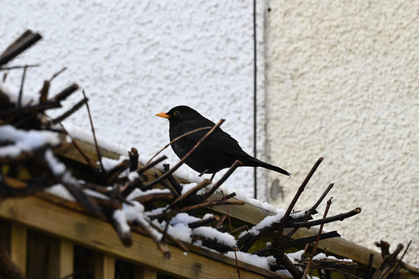
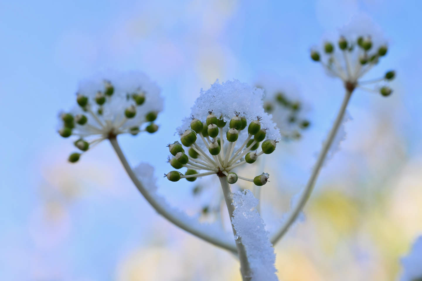
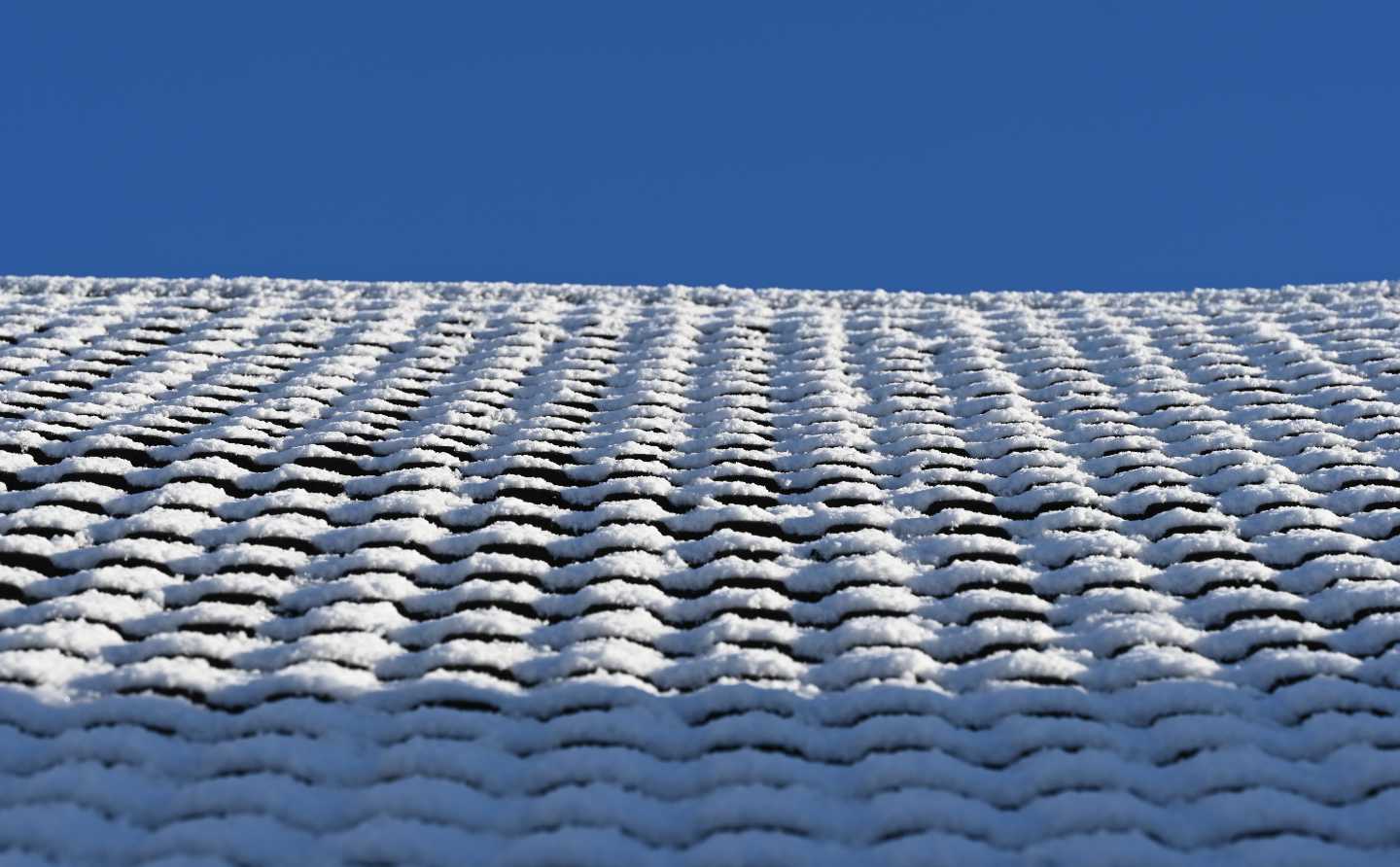
I often do posts with sets of images in a row, and if those images aren't the same aspect ratio they can look a bit messy:
It doesn't look terrible, it's got a scrapbook or pinned-to-the-fridge vibe to it. But, maybe I want them to look a bit neater.
OK, they line up now and form a nice neat image block on the page, but the subject of each of the photos is positioned awkwardly, especially on the moon and snail photos. Now, normally I'd crop the actual images before uploading, but maybe I don't want to always do that. You can click each of these images to see the full thing, and sometimes I'd like the 'on page' view to be a preview. Having a nicely positioned crop of the original image means creating and uploading (and downloading, for you) only one image.
There, better.
What's changed is the CMS I use, Kirby, lets you set a focus point on images (a lot of other CMSs do this too, but I like Kirby and recommend it). The built in stuff for it in the CMS seems to be around creating separate thumbnail images, which is fine and great, but like I said above, I only want one image and to display it nicely using CSS. I ran into a documentation issue, where the use-case in the documentation isn't anything like what I want to do. Ironically if I hadn't updated how I do my blog to match the new way the CMS works, the documentation would have been fine for me.
And then I run into my usual problem with everything to do with my site, I just don't use PHP often enough. I also don't have the time to stay current with it. I could just use some hosted thing and not have to deal with all that, but that wouldn't interest me at all: I like making things and customising things and I just have to deal with the frustration that causes. But I needed help getting this thing to work. Thankfully Jasper offered to help, and on a Zoom call very patiently took me through how to get the values from the CMS into my CSS. I'd posted on the forums asking for help so I posted the solution Jasper helped me with there, in case anyone needs it.
I thought getting the CSS to work would be simple. Where I work we needed to do almost exactly this kind of thing for user avatars. I'd found this article which explains the whole thing very well: Keeping the Focus Point in the Centre with CSS. But! The way I'd made my templates meant the technique didn't work so well. I simplified it a lot and it works fine enough for me:
img {
display:block;
max-width:100%;
object-position:
clamp(0%, var(--crop-focus-x), 100%)
clamp(0%, var(--crop-focus-y), 100%);
}
So there it is. I think I'll be using that a lot. Probably quite soon as I've taken a lot of photos of things in the garden and I've only posted a few of them online (to Mastodon).