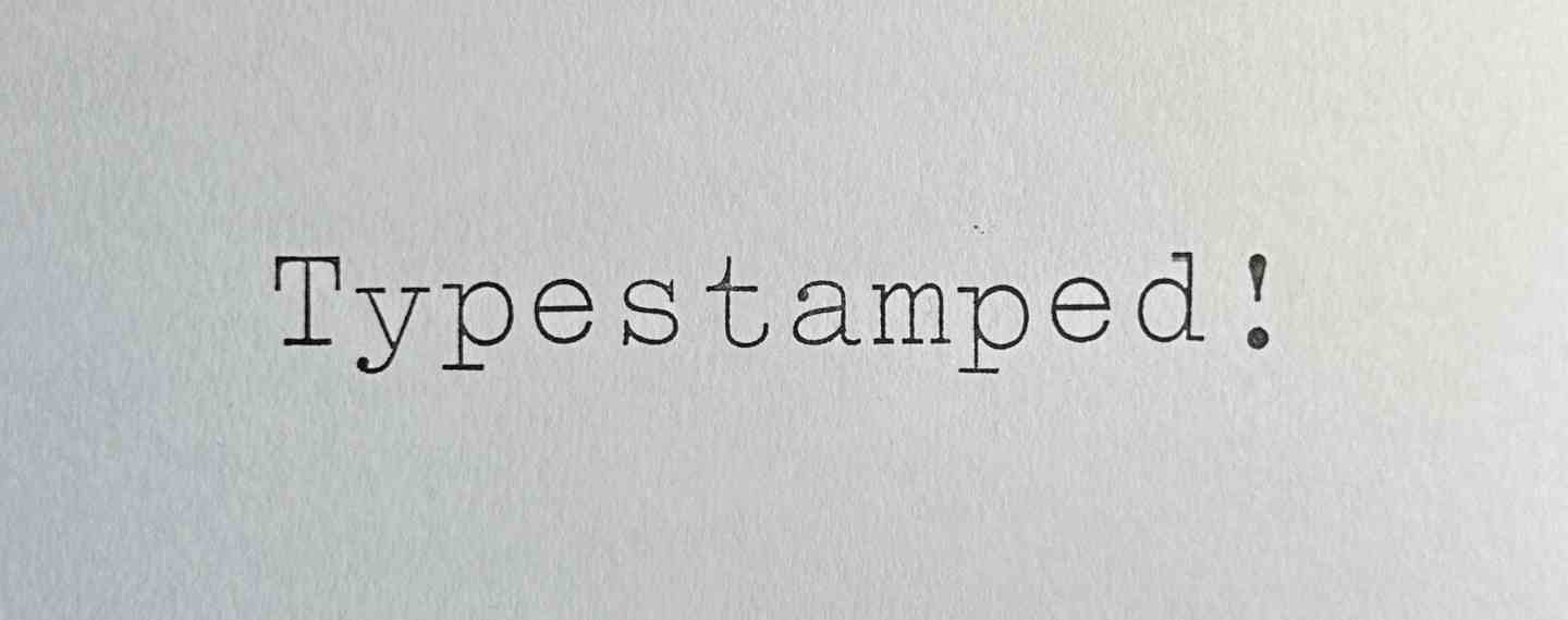
Typestamped
I use an Olivetti Lettera 35 for a lot of things now. I enjoy using it for a whole bunch of reasons, but the main one is that you don't have to manage it. It's just there. Paper in, type. No notifications to turn off, no software updates, no battery, no power. Computers are great and all and do so much, but it's nice to have a break from all their admin.
I also like the typeface the Olivetti uses (Elite) and that there's red and black and nothing else, but I did fancy being able to make large headings or labels to match, as I keep some pages in cardboard folders and it'd be good to label them. They're too big and stiff to go through the typewriter and the card is coloured so the type won't show up anyway. So, paper labels? Yes… but… that wouldn't be fun.
A while ago I bought some (link: https://www.presentandcorrect.com/products/alphabet-rubber-stamps text: alphabet ink stamps from Present and Correct) and they're nice but what I found was they're hard to align and space out evenly. They're also all in capitals in that typeface that reminds me of assembly instructions for workshop equipment.
What they need is a template, something you can place on the paper with slots for the stamps to go in one by one. They'll all be in a line and evenly spaced.
And while I'm at it, wouldn't it be good to have stamps that are the same typeface as the typewriter, and the same range of characters?
And wouldn't it be also good to have the whole lot in a nice box so they're easy to store and get to when you want to use them?
Why yes, yes it would!
And lo, was a long and sometimes tedious project born.
Design
The Stamps
I needed to see if the stamps were going to feel the right size. I have a stock of 9mm plywood, so I figured I'd cut the stamp bodies out of that. That means each one would be 9mm wide. Looking at the typeface I figured out that a 2:1 ratio would be about right, so they'll be 18mm tall. The actual body of each stamp, the bit you hold, could be any length but it would need to be not so long as to be unwieldy and long enough that the template could provide a sufficient vertical guide while allowing you to still hold it. I went for 50mm.
Before cutting out the wood, I wanted to see whether the typeface would work as a rubber stamp. It's used on typewriters a lot smaller so I didn't see why not, but I need to check whether I could make it using the equipment and materials I had. I tried a single numeral 5 using a couple of settings on an offcut. It seemed to work and so I started cutting out the alphabet.


Oh, wait. That's the wrong way round. Stamps are for printing so need to be reversed to print an image the right way round. I knew this, of course I knew this, but it looks right so… yes, well. With practice maybe I'll stop making this mistake (I doubt it).
Then there's the caps on the stamps. These need to be the right way round as they're the labels that go on the top so you can tell which stamp is which. More on this later, but I initially did some in 1.6mm ply, and was going to fill in the laser-etched letters in paint.


You'll notice the letter cap is on top of a piece of wood. Once I'd done a couple of tests I cut out all the stamp bodies.


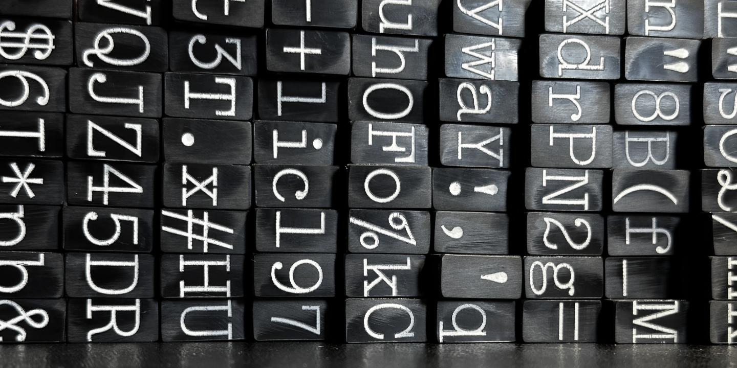
There are a lot of them. 86 of them. For the rest of the project I was scared I'd lose a letter cap or a rubber stamp face or a stamp body and not have enough and it'd be a pain to redo them, so I was constantly counting them to make sure.
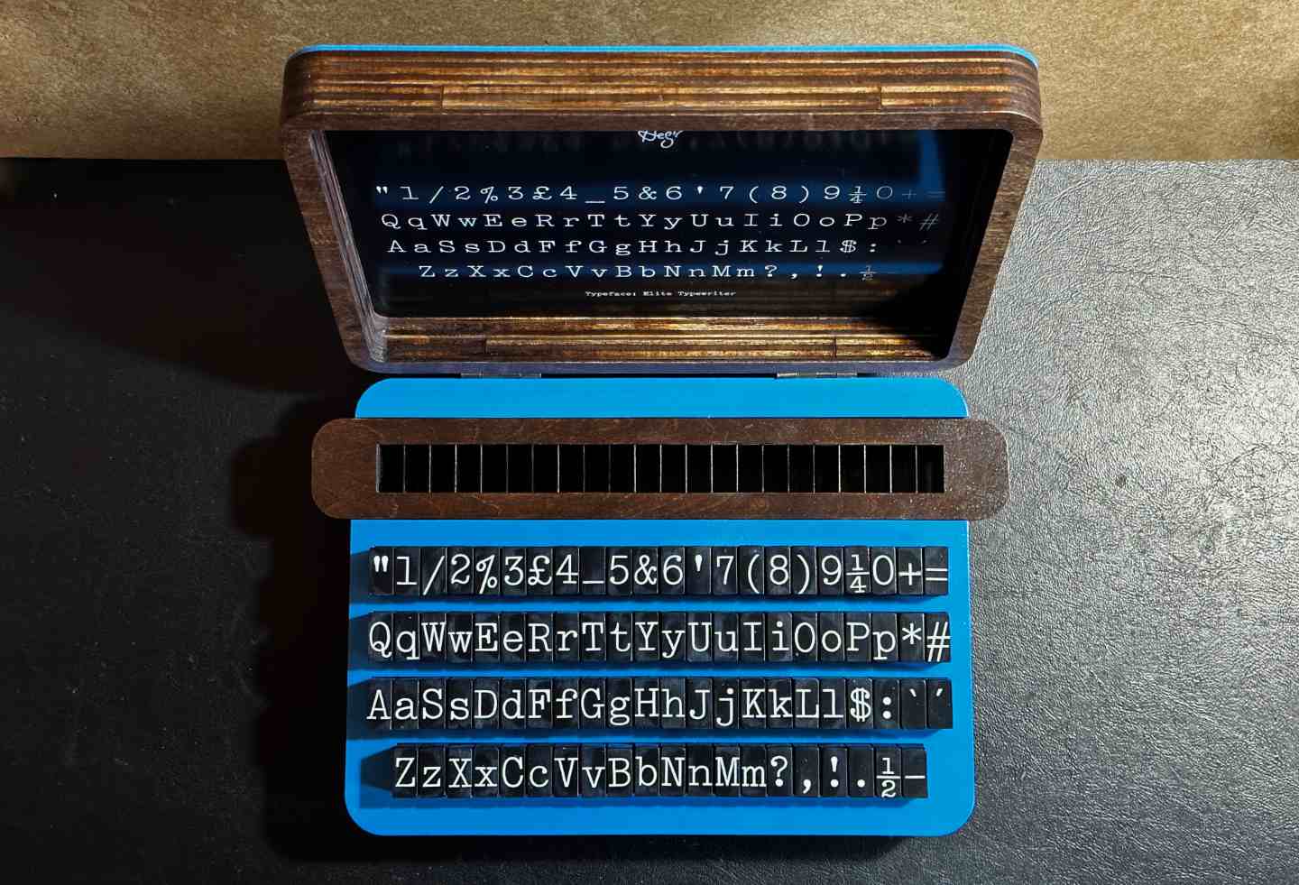
The Template
Now I have a good sense that the stamps themselves are the right size, I can design the template. I'm going to use these on all sorts of paper sizes, but I usually use A4 so I'll base it on that. The template needed to have feet to hold it above the paper slightly, and it needed to have enough height to provide a good guide to the stamps, and it needed dividers to space out the stamps. I had some 0.5mm acrylic sheet and cut dividers out of that. Giving a couple of a tenths of a millimetre leeway I could fit 22 letters across the width of an A4 sheet.
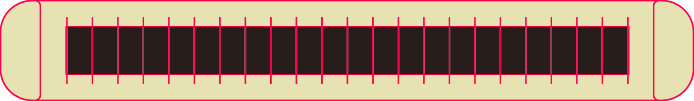
This bit of the project went really well. It just all went together so easily and neatly. The plywood cut out with the notches for the acrylic, the acrylic all cut out cleanly and the glue was so satisfying to apply. I put the acrylic dividers in their slots and wiped the glue brush along them so they'd be held firmly in place without any glue leaking out.


I then stained and sealed the template, and went to work on the rest of it.
The Box
I wanted the stamps to be stored in the box in as close to 'typewriter configuration' as possible. Like with a computer keyboard you press shift on a letter and you get the uppercase. Do the same on a number or punctuation and you get a symbol or a different punctuation. For stamps, placing the alternative character above the other would make a very long narrow box. Side by side was the better option, and because they were 2:1 height to width ratio, they'd make a neat set of squares resembling a regular typewriter keyboard!
Unfortunately, that would make a very wide box and would complicate how the template would fit and how you'd get it out of the box. I already had an idea that the curved ends of the template should stick out the sides of the box. So, an adjustment, and a colour scheme (my typewriter is that same blue).
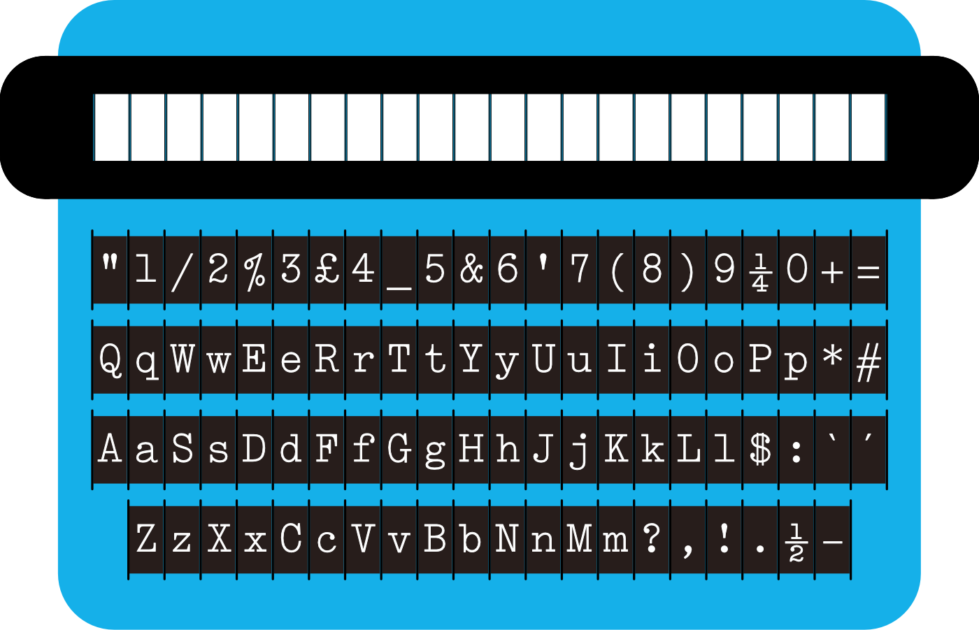
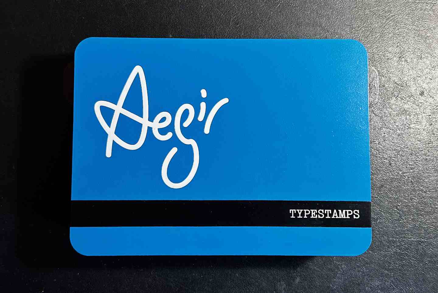
I also designed a lid for the box with my logo (of course) and a guide to where the stamps should be put back on the inside.
The Build
Lettercaps
This bit didn't go so well. Well, maybe it did? It just took a lot of attempts.
I wanted the caps on the stamps to have a clear good contrast letter on it. I liked the idea of it being white letters on a dark background, so tried various ways of doing that. Dark letters on light would have been easier but I don't think I'd have liked the result as much.
I tried white enamel paint, but it got absorbed into the wood. I spent quite a long time on this with a paint syringe hoping a few coats would do the job. It seemed so hopeful, but no. I tried with wood that was stained and sealed before laser etching, sealing it after laser etching, but nothing worked. Either the paint soaked in and disappeared or there was too much texture in the surface and it wasn't a clean finish. It was messy.
I then tried with the veneer waxes which gave a slightly better result, but still messy and the pressure I had to use caused some pieces to crack and led to me having an uncomfortable bruise on my hand.


I don't think I have photos of all the attempts and things I tried, but I do have a photo of some of the debris below, along with the thing that worked eventually. The acrylic I'd used for the dividers turned out to be the thing that worked. Mostly.


The acrylic gave the cleanest result. I did lightly sand the surface to remove some of the burrs from laser etching, which I think was a mistake because it created a slightly uneven finish. Once I'd sealed them all with varnish it wasn't noticeable though. Also, I etched the acrylic quite deeply so some of the laser caps were fragile.
In the end I glued them on and then applied the veneer wax, and it worked so nicely it made up for the disappointments before.
Assembling the Stamps
I had stained the stamp bodies, then sealed them. Then noticed they were too rough and so sanded them gently and that removed the sealer and the stain. So tried again, but that didn't work as the stain reacted with the old sealer and it all went sticky, so that all came off and I decided to paint them. This all sounds so calm, but it was quite tedious. Part of the issue is that laser cutting creates a bit of charring but also brings out remaining resins in wood, including plywood. That can cause issues when you've a lot (86! Count em again! I did!) of things and are extremely bored of sanding things by this point. Also, I wish I'd worn gloves. I got wood stain and paint on my hands and that stuff can really damage your skin. I was very, very sore for a few days after.
So I painted them, then I masked them and put a blue line to indicate the bottom of the letter, which is important for things like q and b. Job done, I thought. Ha.


The red circles are from my bench. The plywood I was using to hold the stamps had three circles cut out of it from an earlier project. The plywood had got damp (thanks leaky garage roof) so couldn't be used for making things, but is good as a painting shield.
Things were at last coming together. I waxed the letter caps. A couple broke and I had to re-glue them, but only a couple, and it didn't seem to be a major issue. That's a relief. I then sprayed them with clear acrylic.


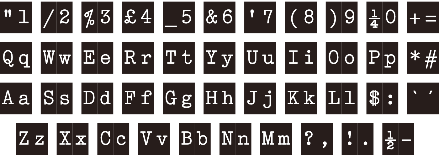
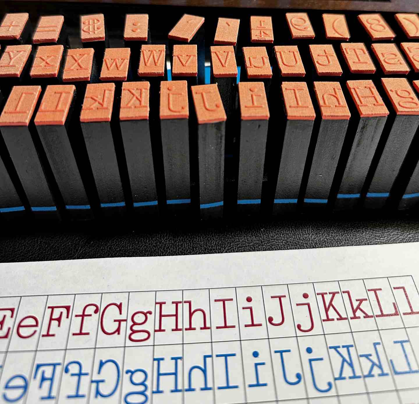
Now to put the business end on them all. This I knew would be difficult because dyslexia and the rubber stamp for q looks like p, and b looks like d. This had the potential to go very wrong, and be exhausting. So, assistive technology to the rescue, in the form of a piece of paper.


As you can see, I made a guide. The reversed character is in the same typeface as the stamp I'm trying to match it with, so it's less of a 'translate this complex shape to a new typeface which is a different complex shape' it's a straight match. Much nicer.
I have a full set of stamps!
Building the Box
This all seemed pretty straightforward. I couldn't put the dividers in right at the start because there were too many to get aligned to slide the next layer of plywood on top. Only a few needed stabilising, and there was a thinner layer of plywood without the notches to cap it all off. It was basically the same construction method I'd used to make the template. You might think it a bit odd to do it this way but it's largely down to adapting things to the tools I have (the laser cutter) rather than the tools I don't (a table saw and suchlike).


I'd cut out pieces for the lid decoration and then used the acrylic again for the layout guide to go on the inside of the lid. It all looked really good and I was pleased with it. I put the hinges on and it makes a nice neat box.


Then it's just a case of putting the stamps in their slots.


There are words to describe my mood here, and I believe I used a lot of them.
What had happened was that some of the layers in a few pieces of plywood had absorbed the stain, or paint, or humidity, and expanded. In a couple of cases the paint was simply too thick. I was able to fix them all with a bit of scalpel work and some ink. In future, I might just use ink to stain things, it worked so well here I wish that's what I'd done at the beginning. But if I had, I wouldn't have known it was the best option. So. We learn.
Done!
All the stamps now fit! It all goes together, it looks great (I will say so myself) and I learned a lot, which hopefully will help with future projects.
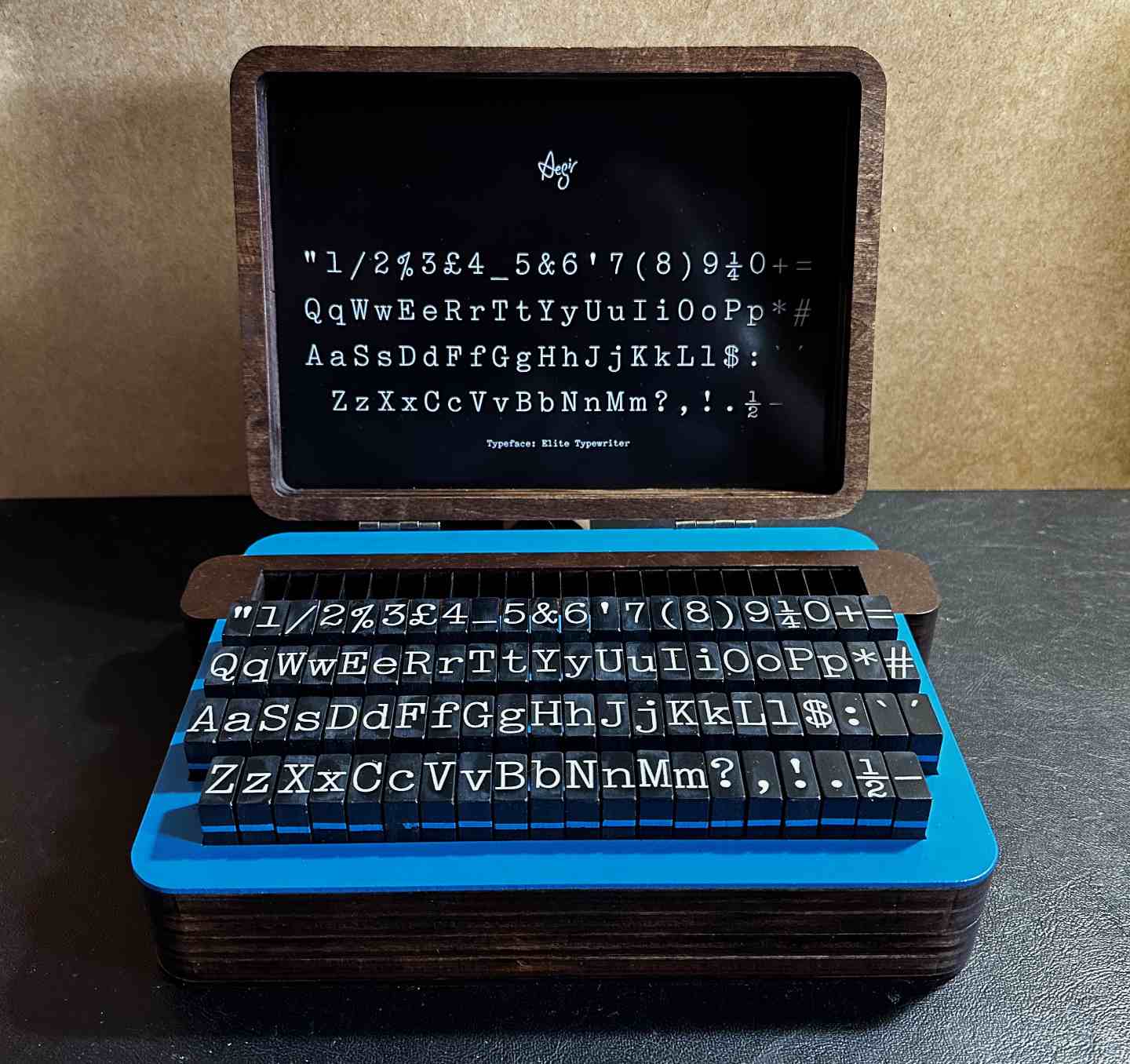
I'm really pleased with the result. It works too, as you can see in the video (if it works).
And if you can't see the video, there's this.